Because of the 2008 recession, obviously, which would undercut the visual argument.
The underlying fundamentals still hold, because no one would ever argue that Obama caused the 2008 recession, while Trump did all of the work of causing the current situation himself with his dumb tariff games.
Starting at 0 would actually be silly for a normalized market index value graph like this one because the market going to true 0 is not a realistic situation. Or thought of another way, this graph is essentially zero-indexed, but 0 is marked as 100 on the Y axis. 90 in this case could be thought of as -10% value and that would be perfectly accurate. These kinds of graphs are usually misleading in other ways, usually by picking specific time ranges to represent or cut off on the X axis. For instance, you could argue that the value that Trump is erasing here is largely offset by the market gains from November to January that could be arguably attributed to speculative optimism about Trump winning the election and so the crash that is shown is actually just a market correction. One might point out that triggering a market bubble and subsequent correction is no matter of pride in response to that argument, but it is there

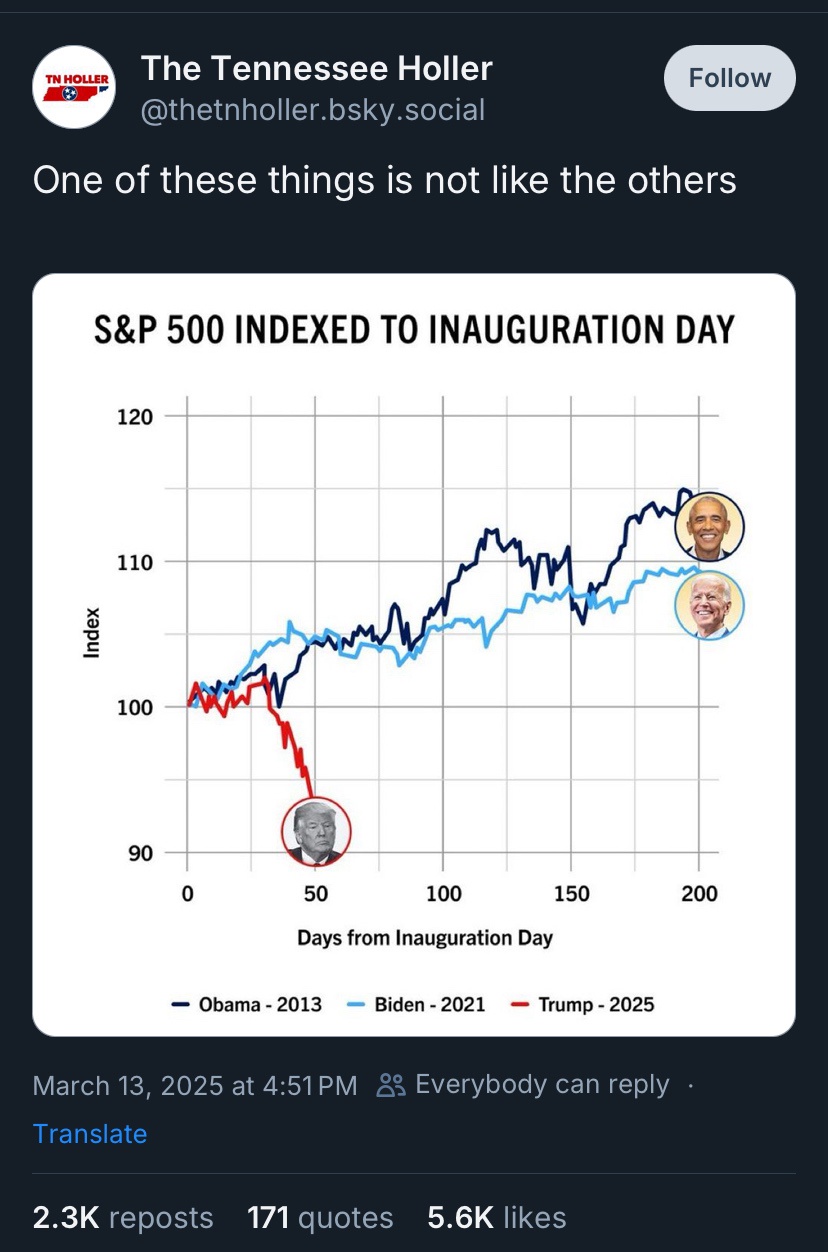
Why cherry pick Obama’s second term?
Because of the 2008 recession, obviously, which would undercut the visual argument.
The underlying fundamentals still hold, because no one would ever argue that Obama caused the 2008 recession, while Trump did all of the work of causing the current situation himself with his dumb tariff games.
Then you get a graph that doesn’t start at zero and you can undercut the visual argument even further
Starting at 0 would actually be silly for a normalized market index value graph like this one because the market going to true 0 is not a realistic situation. Or thought of another way, this graph is essentially zero-indexed, but 0 is marked as 100 on the Y axis. 90 in this case could be thought of as -10% value and that would be perfectly accurate. These kinds of graphs are usually misleading in other ways, usually by picking specific time ranges to represent or cut off on the X axis. For instance, you could argue that the value that Trump is erasing here is largely offset by the market gains from November to January that could be arguably attributed to speculative optimism about Trump winning the election and so the crash that is shown is actually just a market correction. One might point out that triggering a market bubble and subsequent correction is no matter of pride in response to that argument, but it is there