
You must log in or register to comment.
I’m a simple man. I see AI, I downvote.
Real question, how can you tell it’s AI?
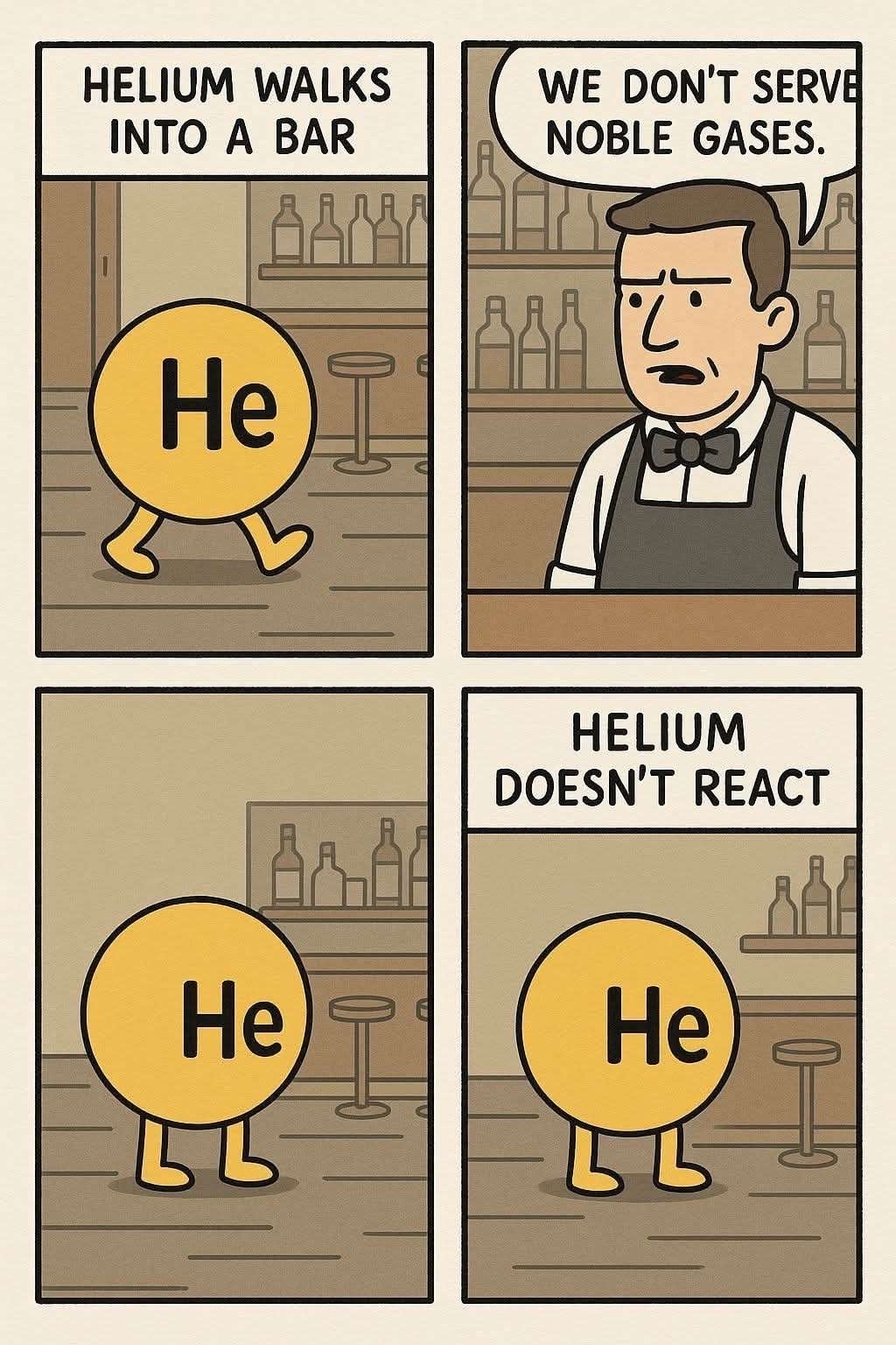
Amongst all the other tells pointed out. The most obvious one right now is whats dubbed “AI-sans font”
There is atm only a single generator that can make this quality though. All ai generators have their unique quirks you learn to identity.
Some things got me suspicious. Some patterns, the art style, the colors are “a strange choosing”… everything is so “overly perfect” except for the letters that feel kind of off… like someone had to unfuck the text. Besides, this is some polished artwork for a random comic with no firm.
But the real give away for me are the bottles
I’m a simple man. I see AI haters, I downvote.

You couldn’t even write that out yourself? You had to post a screenshot of someone else shitposting for you?
Before AI, not everything needed to be custom made for an occasion.
I want to go back to those times.
When people could use a stock photo for an article.
When people could just put a random text over an image they found on the internet and call it a meme.
When people could just put their favorite video game music onto a YouTube video.
When people could just quote something for an occasion.
Probably one of the biggest harm of genAI is making people expect fully custom content for every time, since the AI can do it for the press of a button.
I am soooooooo disappointed in the hundreds of people upvoting AI slop. Stop it.
What makes it AI? I don’t see the usual style mixing that AI is guilty of.
There have been quite a few comics in this style recently. For this specific comic, the background is always changing.
Also, the letter E for “serve” in the second panel is almost completely merged with the line.
AI comic 😞
How can you tell?
edit: I learned a lot today
The inconsistent backround,
the cutoff text in the second panel,
that every panel is slightly different but featuring the same content(for example the “He” on helium is very slightly different in every panel, a regular artist would copy paste the text, not draw it every frame),
the font not being consistent(Look at the “E” in “HELIUM WALKS” and then the “E” in “WE DON’T”),
the absence of period symbols(Image Generation LLMs love to do this)
and the artstyle is very specific to other AI comics that are currently floating around the net.
Also, the off-white color used. AI HATES using pure white backgrounds for comics for some reason.
AI slop
op here, I reposted this from a group chat and didn’t notice, sorry for forever cursing your eyes with the forbidden art
why are people downvoting this? it seems it was an honest mistake.
Mistake? No. Honest? No. How are you people so naïve jfc.
…you good, man? its an ai generated webcomic. its not the anti-christ
AI generated webcomics are the harbingers of the antichrist. Be careful.


